
Big Red Car here looking for some labor love. Nah, I’m way overstocked in love, but I do want to talk about how the labor picture looks in the United States.
The top line shout out is — low unemployment, wage gains, and more job openings than people to fill them, but the real picture requires us to look a little deeper. So, we shall.

OK, I get it. It’s not labor day, but we’re talking “labor” right? If you have a job, every day is labor day.
Unemployment
The unemployment picture is good. [I hate the BLS U-3 standard for unemployment, but its use is so widespread, it is the gold standard. The trend is useful as it indicates direction.]

Note that this is core work force ages 25-54. It is low and the trend is downward. It has been quite a ride. You are going to see meaningful wage gains as the labor market tightens.
Most important thing is the trend. “Make the trend your friend.”
Labor Force Participation Rate
The LFPR (core ages 25-54) continues to increase, but there is a lot more room at the top end for it to continue. Read the note on the chart to see how many additional jobs are required to return to peak values. We will be there in two years.
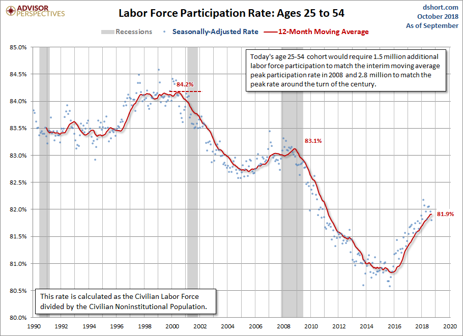
LFPR is the actual civilian work force – people in the core demographic – who have jobs and are looking for jobs divided by the same demographic of the population (those available to work).
As you can see, this is driven by economic activity. The trend changed dramatically in 2016. This is why when the previous admin takes credit for the economic vigor of the current admin, folks are temped to say, “Baloney!”
The upward trend of the LFPR became pronounced in the 2016 time frame when consumer and business confidence indices showed a general turn toward the positive.
Please note that these are 12-month moving average curves which smooths out the impact of any particular month.
Employment-to-Population Ratio
This is a good chart to peruse to see how much of the actual core population is actually working.

This provides a slightly different view of things than the LFPR as it is only folks who actually have a job – meaning it doesn’t include those looking for a job – “participating.”
As you can see, the trend has been reversed and upward since the 2012 time frame. Given that the last recession lasted through the middle of 2009, this shows a slow response to changed economic conditions. Things stopped going down and hung at the bottom before reversing trend and starting to inch upward.
So, dear reader, there you have it. It being low unemployment and a rising LFPR and Emplyment-to-Population Ratio.
Thanks, as always to Advisor Perspectives, dshort.com, Dan Short and Jill Mislinski. These graphs are from those sources which can be accessed at d.short.com.
But, hey, what the Hell do I really know anyway? I’m just a Big Red Car.![]()